Flexbox and Tailwind CSS Deep Dive
October 12, 2022
The A Complete Guide to Flexbox was the best reference I found for explaining how flexbox works.
Below is code for a hero page that uses Tailwind CSS to
- fills the screen from top to bottom,
- the content is centered both vertically and horizontally, and
- this layout is the same across all devices and/or as a browser is resized.
This post explains how Tailwind and Flexbox work to make this happen.
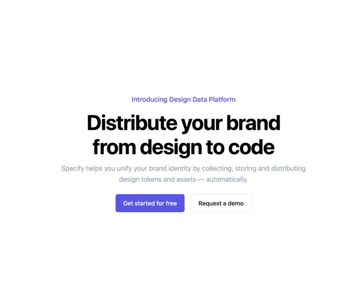
<section class="py-24 flex items-center min-h-screen justify-center">
<div class="mx-auto max-w-[43rem]">
<div class="text-center">
<p class="text-lg font-medium leading-8 text-indigo-600/95">
Introducing Design Data Platform
</p>
<h1 class="mt-3 text-[3.5rem] font-bold leading-[4rem]
tracking-tight text-black">
Distribute your brand from design to code
</h1>
<p class="mt-3 text-lg leading-relaxed text-slate-400">
Specify helps you unify your brand identity by collecting,
storing and distributing design tokens and assets —
automatically.
</p>
</div>
<div class="mt-6 flex items-center justify-center gap-4">
<a href="#"
class="transform rounded-md bg-indigo-600/95 px-5 py-3
font-medium text-white transition-colors
hover:bg-indigo-700">Get started for free</a>
<a href="#"
class="transform rounded-md border border-slate-200 px-5
py-3 font-medium text-slate-900 transition-colors
hover:bg-slate-50">Request a demo</a>
</div>
</div>
</section>
The flexbox container is the section element with the flex class.
<section class="py-24 flex items-center min-h-screen justify-center">
- This flexbox container only has one item, a div.
- py-24: 24 px of vertical padding above (This can be deleted, as it has no effect on the layout.)
- items-center: This tailwind shorthand for “align-items: center” vertically centers the flexbox items along the main axis.
       +--+
       |  |
  +--+ |  |
  |  | |  |
--+--+-+--+--  → The default main axis is L to R for English language.
  |  | |  |
  +--+ |  |
       |  |
       +--+
- min-h-screen: fill screen from top to bottom with section.
- justify-center: This tailwind shorthand for “justify-content: center” horizontally centers the flexbox items along the main axis.
+------------------------------+
| container                    |
|      +------+  +------+      |
|       item      item         |
+------------------------------+
A demo of what this flexbox container gives us.
The following HTML
<section class="flex items-center min-h-screen justify-center border-8 border-black">
    <p class="border border-red-500">Hello World!</p>
</section>
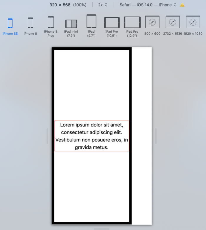
is rendered with the “Hello World!” taking up the entire screen and centered both horizontally and vertically on all devices. Here is how it looks on an iPhone SE:
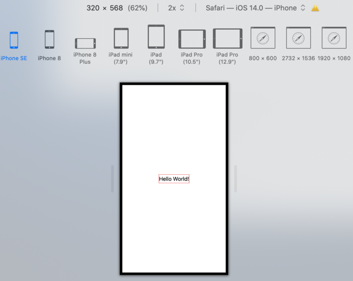
Text is centered as long as it fits on one line.
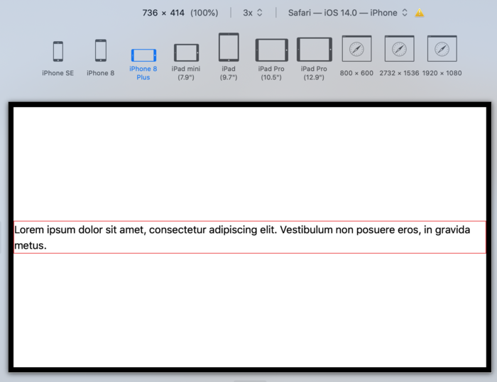
If the text becomes longer than the device width, the flexbox item (the paragraph) is still centered, but the paragraph text is not.
<section class="flex items-center min-h-screen justify-center border-8 border-black">
  <p class="border border-red-500">
    Lorem ipsum dolor sit amet, consectetur adipiscing elit.
    Vestibulum non posuere eros, in gravida metus.
  </p>
</section>
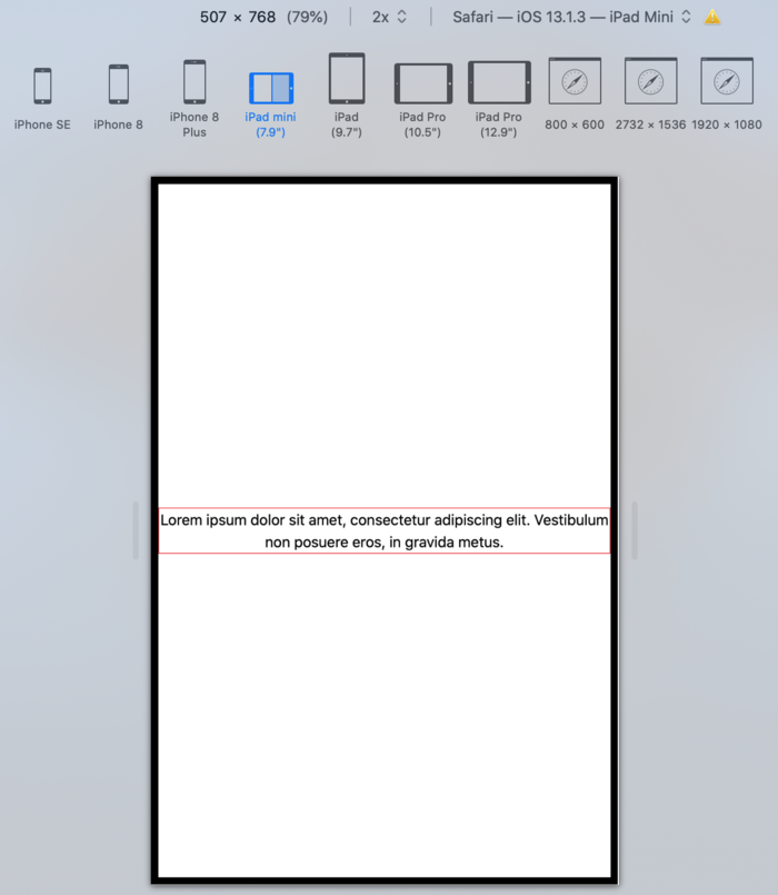
We can center text in the flexbox container.
Adding a text-center class to the flexbox container centers the text.
<section class="flex items-center min-h-screen justify-center text-center border-8 border-black">
  <p class="border border-red-500">
    Lorem ipsum dolor sit amet, consectetur adipiscing elit.
    Vestibulum non posuere eros, in gravida metus.
  </p>
</section>
The last improvement to make is to add padding between the device edges and the text.
Adding maxwith to the flexbox container adds all the padding on the right.
<section class="flex items-center min-h-screen justify-center text-center max-w-[80%] border-8 border-black">
  <p class="border border-red-500">
    Lorem ipsum dolor sit amet, consectetur adipiscing elit.
    Vestibulum non posuere eros, in gravida metus.
  </p>
</section>
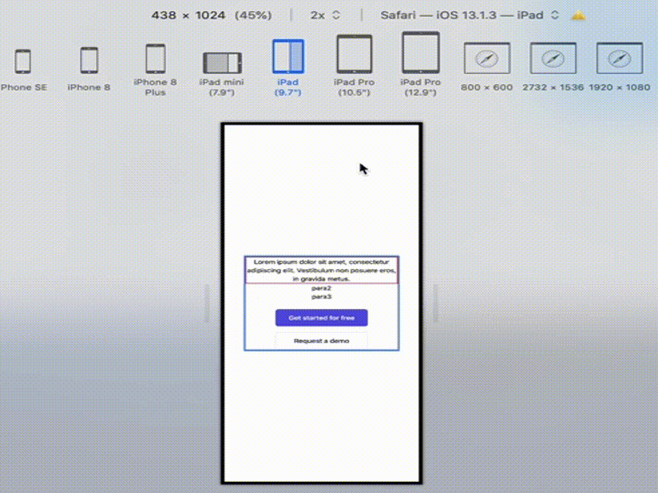
Cut to the final version
To even the padding on the left and right sides of the text, add a div that is narrower than the device, and put all the text inside that div.
Here is a complete example, with three paragraphs and two buttons.
The buttons are in a nested flexbox container that sets the button sizes
with flex basis, and wraps the buttons on a very narrow screen
with flex-wrap.
<section class="flex items-center min-h-screen justify-center border-8 border-black">
  <div class="mx-auto text-center max-w-[80%] border-4 border-blue-500">
    <p class="border-2 border-red-500">
      Lorem ipsum dolor sit amet, consectetur adipiscing elit.
      Vestibulum non posuere eros, in gravida metus.
    </p>
    <p>para2</p>
    <p>para3</p>
    <div class="mt-6 flex flex-wrap items-center justify-center gap-4">
      <a href="#"
           class="basis-[200px] transform rounded-md bg-indigo-600/95 px-5 py-3
            font-medium text-white transition-colors
            hover:bg-indigo-700">Get started for free</a>
      <a href="#"
           class="basis-[200px] transform rounded-md border border-slate-200 px-5
            py-3 font-medium text-slate-900 transition-colors
            hover:bg-slate-50">Request a demo</a>
    </div>
  </div>
</section>
How many users can use Flex?
99.09% of all users can use flex, per https://caniuse.com/?search=flex.